No products added!
Letterhead Design Melbourne trends focus on minimalism and clarity in today’s corporate world. A cluttered header distracts from the message, while a sleek layout commands authority. Your official stationery often makes the first impression on legal documents, contracts, and formal proposals. Therefore, you must treat the page as a key part of your visual identity, ensuring it looks professional sent either physically or digitally.
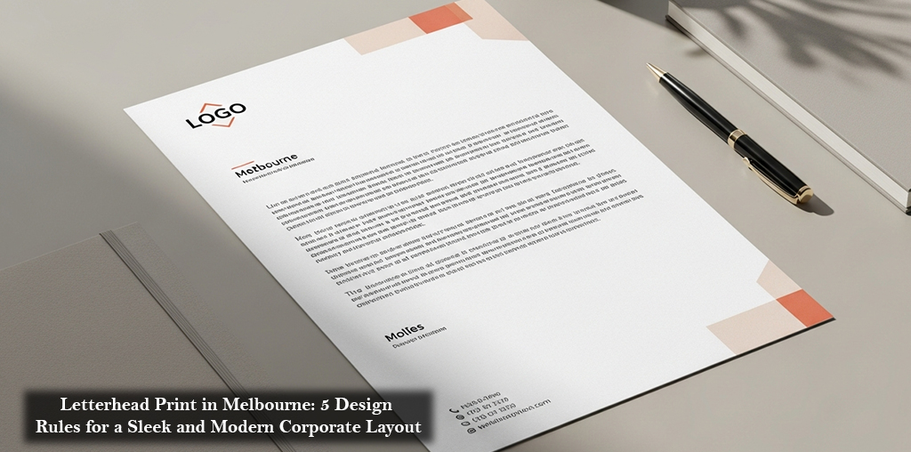
Prioritizing Hierarchy and Simplicity
Effective corporate stationery relies heavily on visual hierarchy. When you finalize your Letterhead Design Melbourne strategy, you should strictly follow the “less is more” principle.
- Logo Placement: Position the logo prominently at the top but keep it proportional to the page size.
- Color Accents: Use brand colors sparingly in borders or footers rather than flooding the background.
- Clean Typography: Stick to legible sans-serif fonts for contact details to maintain a modern aesthetic.
This approach ensures the branding supports the content rather than overpowering it.
The Value of High-Quality Paper
The physical feel of the paper communicates value just as much as the graphic design does. High-quality Letterhead Printing Melbourne services recommend utilizing premium stocks, typically between 100gsm and 120gsm bond paper. This weight creates a substantial, crisp feel in the hand that standard printer paper cannot match. Using quality stock ensures that double-sided printing does not bleed through, maintaining a clean look on both sides of the document.
Layout Optimization for Usability
You must maximize the usable writing space on the page to ensure practicality. When organizing a Letterhead Print in Melbourne, push secondary information like your ABN, website URL, and office address to the footer. This “anchor” technique keeps the header clean and ensures the main body of the letter has ample room for text. It creates a balanced frame for your content, making the document easy to scan and professional in appearance.
Partnering with Experts
Achieving this balance of weight, color, and layout requires professional execution. Mojo Press specializes in producing corporate stationery that meets these exacting standards. They ensure color consistency across print runs, guaranteeing that your corporate red doesn’t turn pink. Their team helps you navigate technical details like bleed and margins to produce a flawless final product.
Modernizing your letterhead is a simple investment that yields high returns in brand perception. By following these design rules, you turn everyday correspondence into a powerful marketing asset. Contact Mojo Press today to print stationery that truly represents the quality of your business.
Read More: Letterhead Print in Melbourne: The Role of White Space in Professional Document